Skift
Story Cards: Editorial Tools to Visualize the News
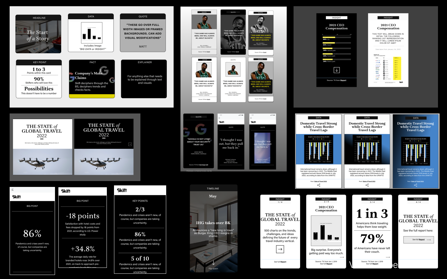
Creating an Editorial Toolkit
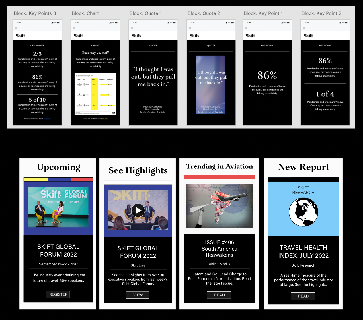
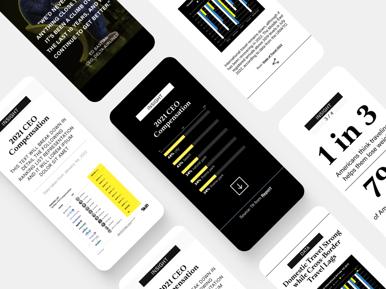
While Head of Creative at Skift, I worked closely with our editorial and product teams. After redesigning the Skift website to create a decluttered, content-focused user experience, I designed a suite of Gutenberg blocks for journalists to visually enhance their stories with custom layouts and modules to highlight data, graphics, quotes, and key points within a story. Designed to be modular and adaptable for the needs of stories – with multiple variations to augment the look of the module without breaking the design system. These blocks were then replicated into the homepage, integrated into sub-brand websites, and replicated in email newsletters for a cohesive, content-rich experience.
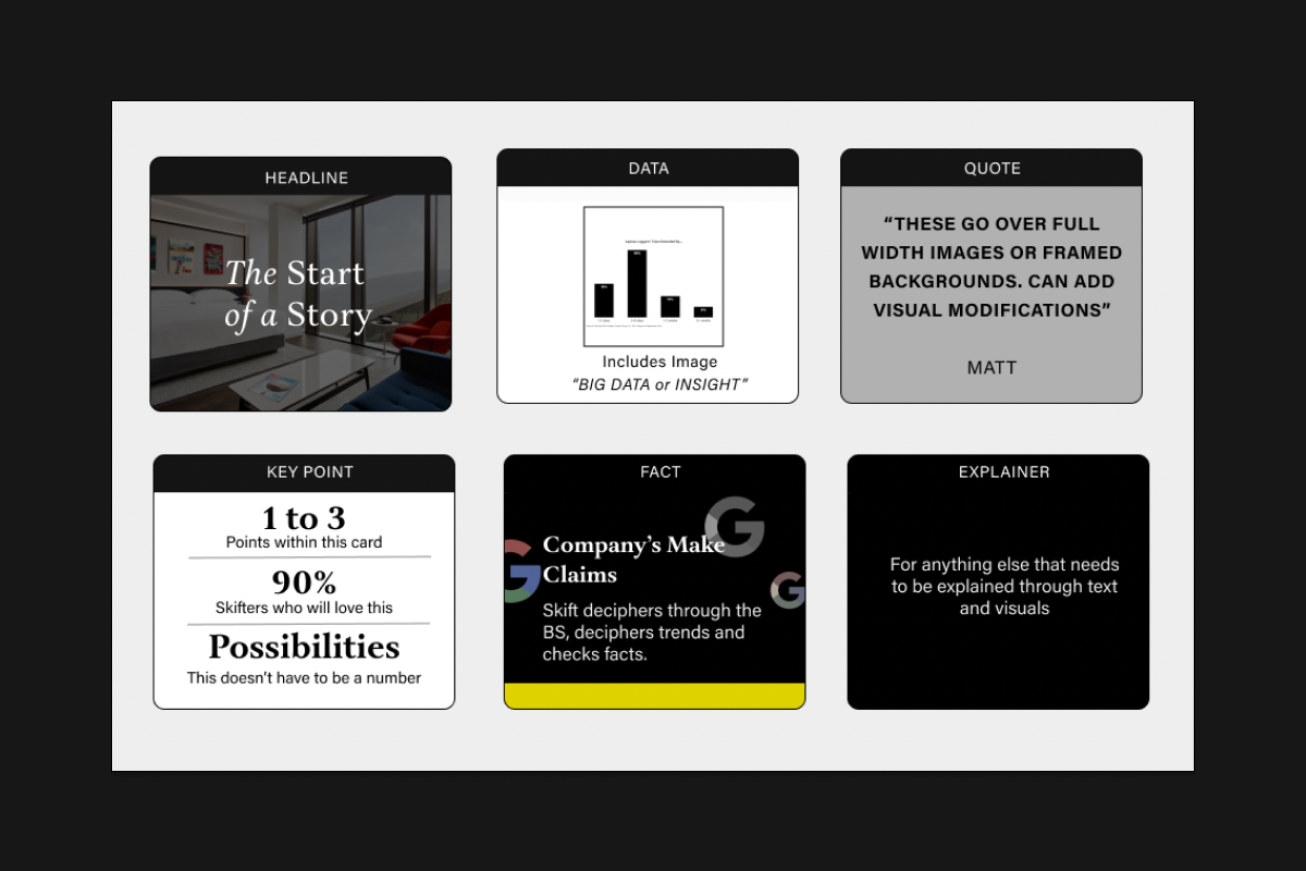
Card Styles
HEADLINE CARD
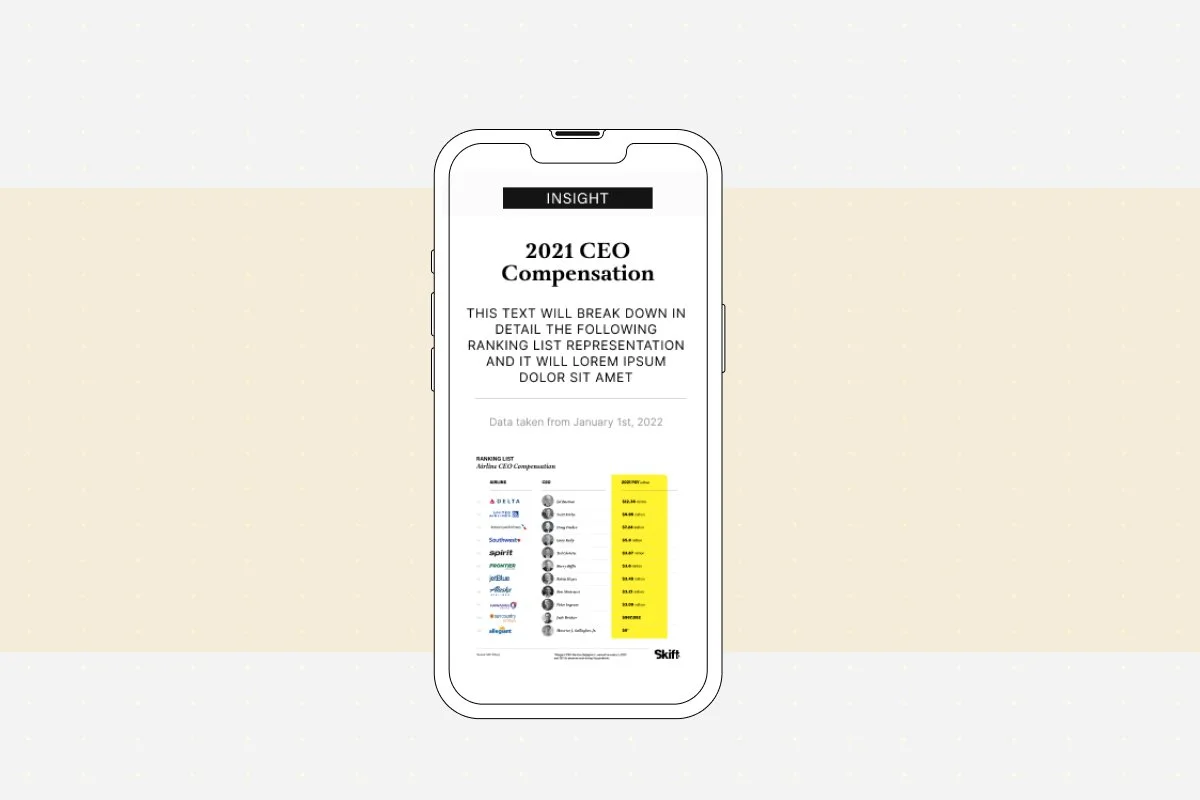
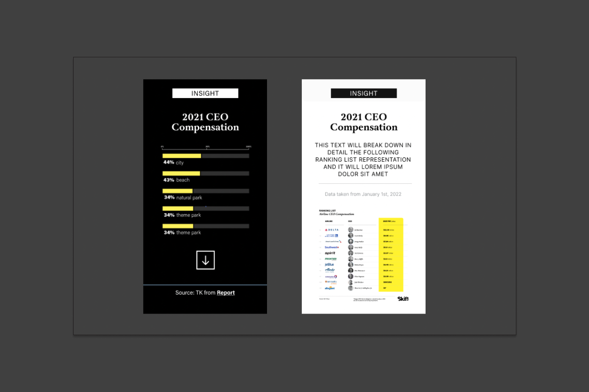
Layouts for editorial special features
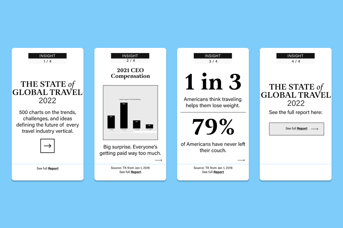
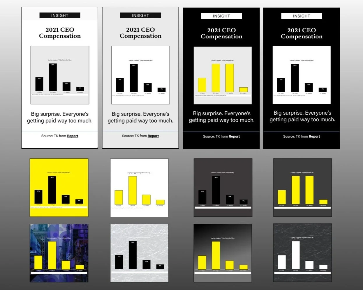
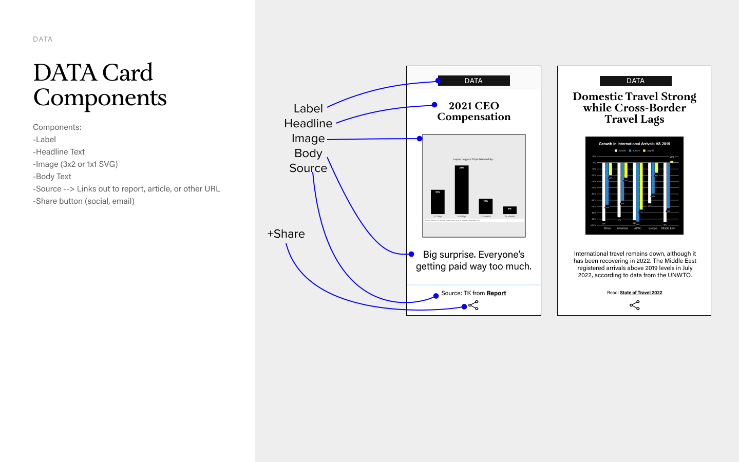
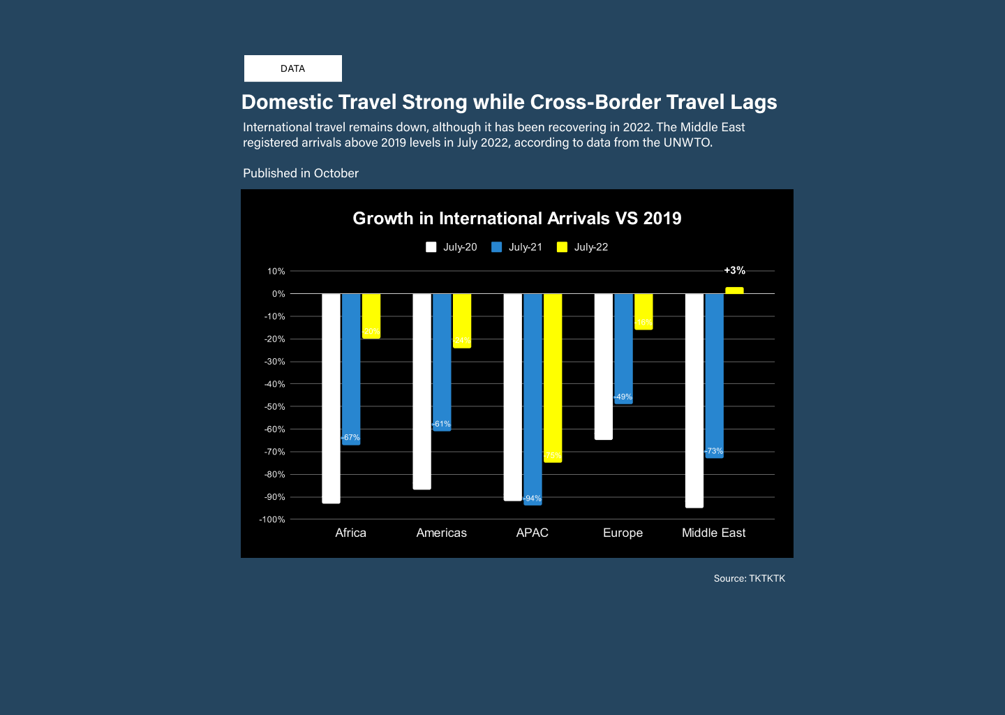
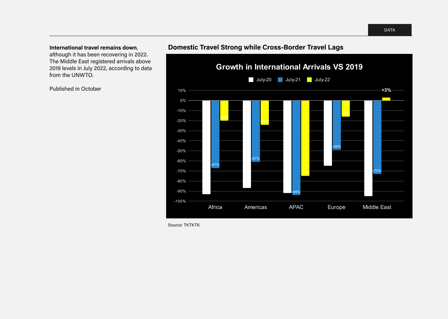
DATA CARD
Used in a story to highlight a chart or data visualization along with a title and blurb.
QUOTE CARD
Used in a story to highlight a quote from a person.
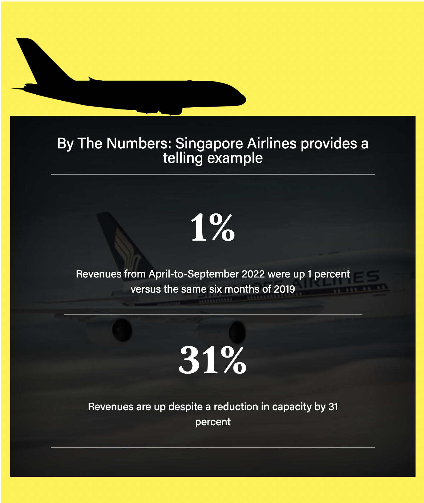
KEY POINTS CARD
Used in a story to call out a big number, statistic, or fact. Variations up to three key points.
EXAMPLE CARD (FACT or EXPLAINER)
Used in a story to illustrate an example or explain something visually, such as a concept or feature.
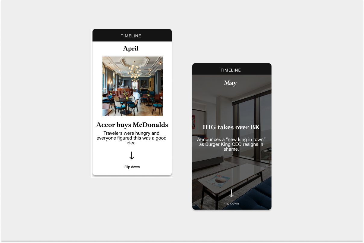
MOMENT CARD & TIMELINE SEQUENCE
Used in a story to call out a specific moment in time which something happened. Sequenced together, this becomes a timeline of events.